Graphic design is a evolving field that requires an eye for aesthetics, a deep understanding of communication, and mastery of various design tools. Yet, even the most seasoned designers face challenging dilemmas when working on projects. From balancing creativity with client expectations to managing technical constraints, navigating these common pitfalls is essential for producing compelling and impactful designs.
Balancing Creativity and Client Expectations
One of the most significant dilemmas graphic designers face is striking the right balance between their creative vision and meeting the expectations of their clients. While designers often aim to push boundaries and explore innovative ideas, clients may have specific preferences or branding guidelines to adhere to graphic design..
Communication is critical to navigating this dilemma effectively. Designers should thoroughly discuss with clients to understand their vision, preferences, and brand identity. By aligning their creative concepts with the client’s goals and objectives, designers can ensure that their work resonates with the intended audience while satisfying the client’s requirements for graphic design..
Overcoming Design Indecision
Designers are often faced with countless options when conceptualizing and executing a project. From choosing color palettes and typography to layout and composition, many choices can lead to decision paralysis or indecision.
To overcome this dilemma, designers can establish a clear design direction early in the process. Conducting thorough research, creating mood boards, and sketching out initial concepts can help streamline the decision-making process and provide a solid foundation for the design. Additionally, seeking feedback from peers or mentors can offer valuable insights and perspectives, helping designers make informed choices without feeling overwhelmed by the possibilities.
Addressing Technical Constraints
In the digital age, graphic designers must navigate various technical constraints of different mediums and platforms. Whether designing for print, web, or mobile devices, understanding the limitations and requirements of each medium is essential for creating successful designs.
For instance, designing for print requires attention to factors such as color modes, resolution, and bleed areas, while web design necessitates considerations such as responsive layouts and browser compatibility. By staying aware of the latest technological advancements and best practices in graphic design, designers can adapt their workflows and techniques to effectively meet the demands of different mediums for graphic design..
Managing Feedback and Revisions
Receiving feedback and accommodating revisions is an inevitable part of the graphic design process. However, managing multiple rounds of revisions can be challenging, especially when feedback is conflicting or unclear.
To navigate this dilemma, designers should establish clear collab channels with clients and stakeholders from the outset. Setting expectations regarding the review process, timeline, and scope of revisions can help minimize misunderstandings and ensure a smoother workflow. Maintaining a collaborative and open-minded approach to feedback can foster constructive dialogue and lead to more successful outcomes.
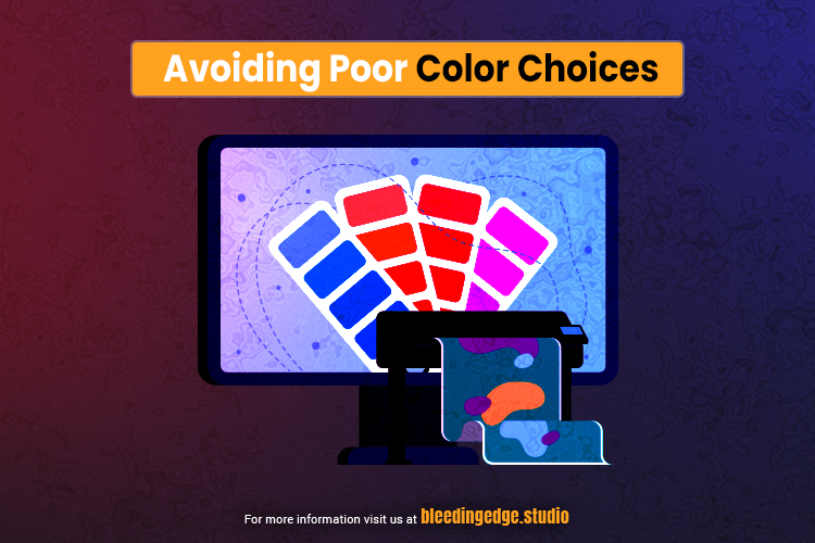
Color Clash: Avoiding Poor Color Choices for Graphic Design
Color is a solid tool in graphic design, capable of eliciting emotions, conveying messages, and influencing perception. However, poor color choices can undermine the effectiveness of a design, leading to confusion, disinterest, or even negative associations. Navigating the complexities of color selection is crucial for creating visually appealing and impactful designs while avoiding potential pitfalls.

Understanding Color Theory
A solid understanding of color theory is necessary for making informed decisions regarding color selection. Color theory encompasses principles such as hue, saturation, value, and complementary relationships, which dictate how colors interact with each other and the viewer’s perception.
By familiarizing themselves with color theory principles, designers can create harmonious color palettes that evoke the desired mood or convey specific meanings. Whether opting for analogous, complementary, or monochromatic schemes, designers can leverage color theory to create visually cohesive and engaging designs for graphic design..
Considering Cultural and Psychological Associations
Colors carry cultural and psychological associations that can influence how viewers perceive and interpret them. For example, red may symbolize passion or danger in one culture while representing luck or prosperity in another. Similarly, blue may evoke feelings of calmness and trustworthiness in some contexts while conveying sadness or coldness in others for graphic design..
To avoid potential clashes or misinterpretations, designers should consider the cultural and psychological connotations of colors when selecting them for a design. Researching the target audience’s preferences and cultural background can help ensure that the selected colors resonate positively and effectively communicate the intended message.
Maintaining Accessibility and Legibility
In addition to aesthetic considerations, designers must prioritize accessibility and legibility when choosing colors for text, graphics, and user interfaces. Poor contrast between text and background colors, for example, can make content difficult to read for individuals with visual impairments or in low-light environments for graphic design..
To enhance accessibility and legibility, designers should adopt to the Web Content Accessibility Guidelines (WCAG), which provide recommendations for color contrast ratios and text legibility. By selecting colors with sufficient contrast and testing designs across different devices and environments, designers can ensure that their work remains inclusive and accessible to all users.
Seeking Feedback and Testing Designs
Even experienced designers can benefit from seeking feedback and testing their color choices before finalizing a design. Presenting drafts to colleagues, clients, or focus groups can provide valuable insights and perspectives, helping designers identify potential issues or areas for improvement.
Testing designs across various devices, screens, and printing methods can also reveal how colors appear under different conditions and ensure consistency and accuracy across platforms. By embracing a collaborative and iterative approach to color selection, designers can mitigate the risk of color clashes and create designs that resonate with their intended audience for graphic design..
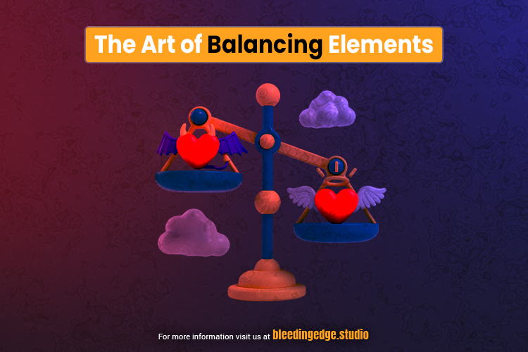
Neglecting White Space: The Art of Balancing Elements
White space, also known as negative space, is a crucial element in graphic design that is often overlooked or underutilized. It refers to the space surrounding and between design factors, such as text, images, and graphics. While it may seem counterintuitive, white space plays a vital role in enhancing visual appeal, readability, and overall effectiveness in design. Neglecting white space can lead to cluttered layouts, overwhelming compositions, and diminished impact. Understanding the art of balancing elements with white space is essential for creating aesthetically pleasing, functional, and engaging designs.
Creating a Visual Breathing Room
White space provides visual breathing room within a design, allowing the eye to rest and focus on critical elements. Designers can improve readability and comprehension by strategically incorporating white space around text blocks, images, and other graphic elements. Ample white space helps to prevent visual fatigue and allows the viewer to navigate the content more effortlessly, leading to a more enjoyable and engaging user experience.
Enhancing Visual Hierarchy
White space is crucial in establishing visual hierarchy within a design, guiding the viewer’s attention and emphasizing essential elements. By adjusting the spacing and alignment of design elements, designers can create a hierarchy of information that conveys the relative importance of each element. For example, increasing the white space around a headline or call-to-action can make it prominently stand out more prominently while reducing the spacing around secondary elements can help de-emphasize them.
Fostering Balance and Harmony
White space is instrumental in achieving balance and harmony in design compositions. By carefully distributing white space throughout a layout, designers can make a sense of equilibrium and cohesion, even in complex or asymmetrical designs. Balancing positive and negative space helps to create a visually pleasing arrangement that feels harmonious and well-proportioned. Designers can experiment with different spacing techniques, such as proximity, alignment, and symmetry, to achieve the desired balance in their designs.
Emphasizing Minimalism and Simplicity
White space is a hallmark of minimalist design principles, prioritizing simplicity, clarity, and efficiency. Designers can create clean, elegant, and sophisticated designs by reducing clutter and unnecessary elements. Embracing white space allows the essential elements of a design to shine without unnecessary distractions or embellishments. Minimalist designs are often associated with modernity, professionalism, and sophistication, making them well-suited for branding, marketing, and digital interfaces for graphic design..
Client Communication Catastrophes: Navigating Feedback Challenges
Effective communication with clients is paramount in graphic design projects, yet navigating feedback challenges can often feel like walking through a minefield. Misunderstandings, conflicting preferences, and vague feedback can lead to frustration, delays, and compromised designs. However, with strategic approaches and proactive communication strategies, designers can navigate feedback challenges and foster positive collaborations with their clients for graphic design.

Establishing Clear Expectations
One of the most common pitfalls in client communication is a lack of clarity regarding project expectations and deliverables. Before diving into the design process, it’s crucial to establish clear expectations regarding timelines, scope, budget, and revision processes. By outlining these details in a project proposal or contract, designers can ensure that both parties are on the same page from the outset, minimizing the risk of misunderstandings later on.
Active Listening and Clarification
Effective communication is a two-way street, requiring active listening and clarification to ensure mutual understanding. When receiving client feedback, designers should listen attentively, ask probing questions, and seek clarification to grasp the client’s expectations and preferences fully. Restating key points and summarizing discussions can help confirm understanding and prevent misinterpretations for graphic design..
Educating Clients on Design Principles
Many clients may not have a graphic design background and struggle to articulate their feedback effectively. Designers can bridge this gap by educating clients on basic design principles and terminology, empowering them to provide more informed and constructive feedback. Designers can facilitate more meaningful discussions and collaborative decision-making processes by explaining typography, color theory, and layout principles.
Setting Boundaries and Managing Expectations
While client input is valuable, it’s essential to set boundaries and manage expectations regarding the extent of client involvement in the design process. Designers should communicate their expertise and authority in design decisions while respecting the client’s vision and objectives. Clearly defining the roles and responsibilities of each party can help prevent micromanagement and maintain a productive working relationship.
Presenting Design Solutions Effectively
How designers present their design solutions to clients can significantly impact how feedback is received and interpreted. Rather than simply sending over design files, designers should provide context and rationale behind their design decisions. Presenting multiple design options and explanations can help clients understand the reasoning behind each approach and make more informed decisions.
Handling Constructive Criticism Gracefully
Receiving criticism is inevitable in the creative process, but handling feedback gracefully and professionally is essential. Designers should approach criticism with an open mind, viewing it as an opportunity for improvement rather than a personal attack. Responding to feedback with empathy, humility, and a willingness to collaborate can foster trust and strengthen the client-designer relationship.
Ignoring Trends vs. Blindly Following: Striking the Right Balance
In the fast-paced world of graphic design, trends come and go with remarkable speed. Designers often find themselves caught between two extremes: ignoring or unthinkingly following trends without considering their relevance or suitability for a particular project. Maintaining the right balance between these approaches is essential for creating timeless and innovative designs that resonate with audiences while avoiding the pitfalls of passing through fads.
The Dangers of Ignoring Trends
While ignoring trends may seem like a safe bet to avoid falling into the trap of dated design, it can also lead to missed opportunities for innovation and relevance. Trends often emerge in response to cultural shifts, technological advancements, or changing consumer preferences, reflecting the moment’s zeitgeist. By disregarding trends, designers risk creating designs that feel outdated or out of touch with contemporary aesthetics, ultimately failing to engage or resonate with their intended audience.
The Pitfalls of Blindly Following Trends
On the other hand, unthinkingly following trends can result in designs that lack originality and fail to stand out in a crowded marketplace. Trends are transient, with what’s popular today likely to become passé tomorrow. Designers who chase trends risk producing work that quickly becomes stale or clichéd, failing to leave a lasting impression or convey a unique brand identity. Moreover, unthinkingly following trends can lead to homogenization, with designs lacking individuality and diversity.
Striking the Right Balance
Striking the right balance between ignoring trends and unthinkingly following them requires a nuanced approach considering each project’s context, audience, and objectives. Designers should remain aware of current trends and cultural movements but approach them critically, evaluating their relevance and applicability to the project. Rather than slavishly adhering to trends, designers should seek inspiration from diverse sources, drawing on various influences to create fresh, authentic, and timeless designs.
Understanding the Why Behind Trends
Instead of simply imitating trendy aesthetics or techniques, designers should strive to understand the underlying motivations and principles driving these trends by delving deeper into the why behind trends; designers can glean valuable insights into broader shifts in consumer behavior, technological innovations, or cultural movements for graphic design.
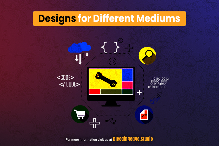
Print vs. Digital: Adapting Designs for Different Mediums
In the realm of graphic design, versatility is vital. Designers often find themselves tasked with creating visuals for print and digital mediums, each with its unique set of considerations and requirements. Adapting designs effectively for these mediums involves understanding their distinct characteristics, technical constraints, and user experiences. By mastering the art of adaptation, designers can ensure their creations shine across various platforms, engaging audiences and achieving desired objectives.

Understanding the Mediums
Print and digital mediums offer distinct opportunities and limitations for graphic designers. Print design encompasses physical materials such as brochures, posters, and packaging, where tactile qualities, color accuracy, and print resolution are crucial. On the other hand, digital design involves creating visuals for screens, including websites, mobile apps, and social media platforms, where considerations such as responsiveness, interactivity, and file formats come into play.
Adapting Design Elements
When transitioning a design from print to digital or vice versa, designers must adapt various elements to suit the medium’s requirements. For instance, typography may need to be adjusted for screen readability, while images may require optimization for web use to make sure fast loading times. Colors may also appear differently in print and digital formats due to variations in color profiles and display settings, necessitating careful adjustment for consistency.
Responsive Design for Digital Mediums
Responsive design has become increasingly important in the digital realm as users access content across many devices with varying screen sizes and resolutions. Designers must create layouts that adapt seamlessly to different screen dimensions, ensuring a consistent and user-friendly experience across desktops, laptops, tablets, and smartphones. Techniques such as fluid grids, flexible images, and media queries enable designs to scale and reflow dynamically based on the user’s device.
Interactive Elements and User Experience
Unlike print, digital mediums offer the opportunity for interactivity, animation, and dynamic content. Designers can incorporate interactive elements such as clickable buttons, menus, sliders, and animations to enhance user engagement and create immersive experiences. However, it’s essential to balance creativity and usability, ensuring that interactive elements enhance rather than detract from the user experience.
Optimizing for Print Production
Preparing files for production in print design requires careful attention to technical specifications such as color mode, resolution, and bleed areas. Designers must ensure that their files are formatted correctly for the printing process, whether offset printing, digital printing, or specialty printing techniques. Collaboration with printers and understanding the production workflow are crucial for achieving print quality and consistency.
Maintaining Brand Consistency
Maintaining consistency is paramount for brand recognition and trust regardless of the medium. Designers must ensure that visual elements such as logos, colors, typography, and imagery remain consistent across print and digital materials. Establishing brand guidelines that dictate how these elements should be used ensures coherence and reinforces the brand identity across all touchpoints for graphic design.
Conclusion
While graphic design presents its fair share of challenges and dilemmas, navigating these common pitfalls is essential for producing exceptional work. By balancing creativity with client expectations, overcoming design indecision, addressing technical constraints, and effectively managing feedback and revisions, designers can create impactful and visually stunning designs that resonate with audiences and achieve the desired objectives. Designers can elevate their craft and thrive in an ever-evolving industry through strategic problem-solving and a commitment to continuous learning and improvement for graphic design.
For more topics, see https://bleedingedge.studio/blog/

